
How Colour Psychology Affects Mood in Your Home: Creating Calm Through Thoughtful Design
There’s something quietly transformative about walking into a home that instantly makes you feel at ease. Before you have noticed the furniture, admired the artwork or taken in the finer details, your shoulders soften. The space feels lighter, calmer and more welcoming.
We often assume this feeling comes from beautiful interiors, thoughtful styling or the absence of clutter. While those things certainly play a part, colour also has a powerful influence on how a room feels.
This is the essence of home colour psychology. It is the understanding that the colours surrounding us affect far more than the appearance of a room. They can influence mood, energy, focus and the way we move through our homes each day.
Colour can make a room feel restful or energising, expansive or intimate, comforting or overwhelming. When chosen with intention, it becomes one of the simplest tools for creating a home that genuinely supports everyday life.
At Homefulness, we often say that organisation is not about creating a home that looks perfect. It is about creating one that feels good to live in. That feeling is shaped by many elements: thoughtful systems, uncluttered surfaces, natural light, texture, flow and colour.
In this guide, we explore how colour psychology affects mood in the home, which colours can help create calm, and how colour and organisation can work together to make everyday spaces feel more considered.
What Is Home Colour Psychology?
Home colour psychology is the idea that colour can influence how we feel and behave within a space.
It is not about following strict rules or choosing colours because they are fashionable. It is about thinking carefully about how each room needs to support you.
A bedroom might need to feel restful. A kitchen may need to feel warm and welcoming. A home office might need to support focus. A family room may need to feel relaxed, sociable and easy to spend time in.
The most successful homes do not choose colours in isolation. They consider how colour works alongside light, storage, furniture, texture and the natural routines of the household.
A colour that feels peaceful in one room may feel flat in another. A shade that feels warm in morning light may feel heavier in the evening. This is why colour psychology works best when it is treated as part of the wider home, not just a decorating decision.
How Does Colour Affect Mood at Home?
Colour affects mood because it changes the atmosphere of a space before we consciously register the details.
Soft greens, warm whites, muted blues and earthy neutrals often feel calming because they are gentle on the eye and inspired by the natural world. These calming colours for home seem to ask less of us. They do not compete for attention or fill a room with visual noise. Instead, they provide a quiet backdrop against which everyday life can unfold.
There is something deeply comforting about colours that echo nature. A soft sage green can recall woodland walks and summer gardens. Gentle blue can bring to mind open skies and still water. Warm oat, linen and stone shades can feel grounded, familiar and reassuring.
That does not mean every home needs to be neutral, minimal or muted. Colour psychology is not about removing personality. It is about asking how you want a room to make you feel before deciding how you want it to look.
Calming Colours for Different Rooms
Different rooms ask different things of us, so the colours that work best will often depend on the purpose of the space.
Bedrooms
Bedrooms are where we begin and end each day. They often work best with softer palettes that encourage rest rather than stimulation.
Gentle greens, warm whites, muted blues, soft taupes and natural linen tones can help create a sense of quiet. The goal is not to make the room feel plain, but to reduce visual pressure so the space feels restorative.
Kitchens
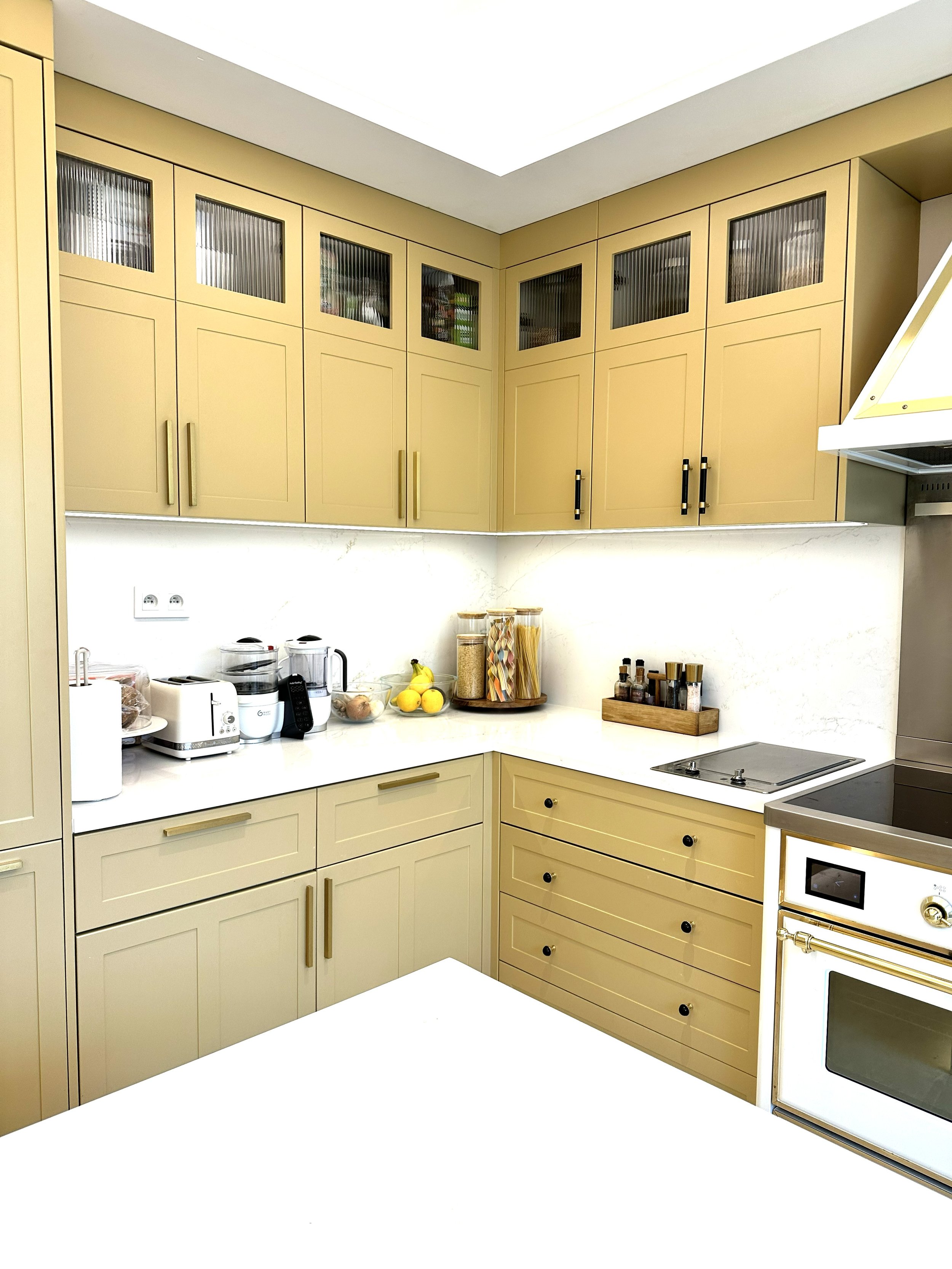
Kitchens are places of movement, conversation and routine. They often benefit from warmth.
Soft creams, gentle neutrals, warm whites, pale terracotta, muted olive and natural wood tones can help a kitchen feel welcoming without becoming overwhelming.
In a busy family kitchen, colour also works best when the space itself is organised. Even the most beautiful palette can feel lost if worktops are crowded and every surface is competing for attention.
Living Rooms
Living rooms need to support many moods. They might be used for family time, entertaining, reading, relaxing or quiet evenings at home.
Warm neutrals, soft greens, muted blues and layered natural textures can help create a space that feels calm but not cold. The key is balance. A room should feel restful without losing warmth or character.
Home Offices and Study Spaces
Colour can play an important role in focus. There is no single shade guaranteed to improve productivity, but some colours can help create a more supportive environment.
Soft blues are often associated with clarity and concentration. Gentle greens can reduce visual fatigue and help a space feel balanced during longer periods of work. Warmer tones can bring energy and creativity when used thoughtfully.
The most important thing is that the colour supports the purpose of the room.
How Colour and Organisation Work Together
Colour does not work alone. Its effect is constantly influenced by everything around it.
Natural light changes throughout the day, altering the warmth or coolness of a shade. Texture softens hard surfaces and introduces depth. Timber, stone, woven baskets and linen all change the way colour is experienced.
Most importantly, organisation has a significant impact on whether colour is able to do its job.
Think about the last time you walked into a room that felt busy. Perhaps the worktops were covered with paperwork, chargers and unopened post. Maybe the shelves were filled to capacity, or there were simply too many objects competing for your attention.
Even if the walls were painted in the softest sage green or the most beautiful warm white, chances are you did not notice the colour first. Your eyes were busy processing everything else.
This is why colour and organisation are so closely connected. Beautiful paint cannot compensate for visual clutter, just as an organised room can still feel cold or uninviting if the colours do not support the atmosphere you want to create.
When visual noise is reduced through thoughtful organisation, colour is finally given space to breathe. Soft greens appear softer. Warm neutrals feel more comforting. Natural light has more room to move through the space.
Often, this is when a home begins to feel different, even if nothing structural has changed. It is not one single change being noticed. It is the way everything starts working together.
How to Choose Colours That Support the Way You Live
Before choosing colours for a room, it can help to pause and ask what the space needs to do.
Ask yourself:
How do I want this room to feel?
What activities happen here every day?
Do I need the space to feel restful, focused, sociable or energising?
Is the room naturally light or does it need warmth?
Are there already textures, furniture pieces or materials that influence the palette?
Does the room currently feel calm, or is there too much visual noise?
These questions help shift the focus from trends to intention.
A beautiful colour is only successful if it supports the way the room is lived in. A bedroom that looks elegant but feels stimulating may not support rest. A home office that looks stylish but feels visually busy may make concentration harder. A kitchen that feels warm but overcrowded may still feel tiring to use.
The aim is to choose colour as part of the wider system of the room.
Organising With Colour
Most of us think of colour as decorative, but it can also be practical.
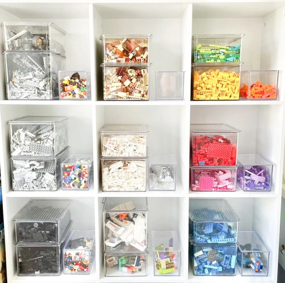
Organising with colour can help the brain categorise information quickly. It is the same reason children recognise coloured coat pegs at school, or why certain folders become associated with specific projects at work. Colour simplifies decision-making.
At home, those decisions happen constantly. We reach for a favourite mug, find the batteries, return children’s craft supplies, put away laundry, sort paperwork and move between different tasks without really thinking about it.
When colour is used thoughtfully within those systems, the process becomes more intuitive.
For example:
matching baskets can create visual consistency
softly coloured folders can make paperwork easier to identify
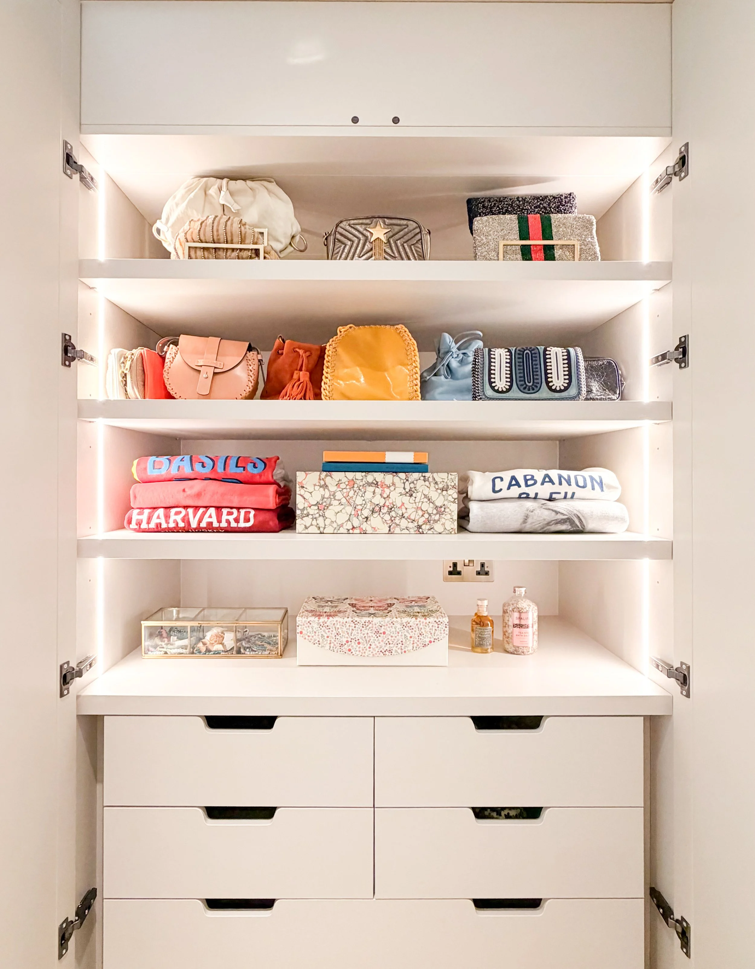
tonal wardrobe organisation can make getting dressed feel calmer
different coloured storage can help children understand where items belong
consistent containers can reduce visual clutter in pantries, utility rooms or play spaces
The goal is not to colour-code your life for the sake of appearances. The goal is to reduce friction.
The easier it is to understand a space, the easier it becomes to maintain it.
Using Colour Zoning at Home
As homes have evolved, many rooms now serve more than one purpose. A dining table might become a workspace during the day before returning to family dinners in the evening. A spare bedroom might double as a study. An open-plan kitchen may become the centre of almost every daily routine.
Without clear boundaries, these multifunctional spaces can begin to feel chaotic, even when they are tidy.
Colour zoning home techniques can help create subtle separation without needing walls or major changes.
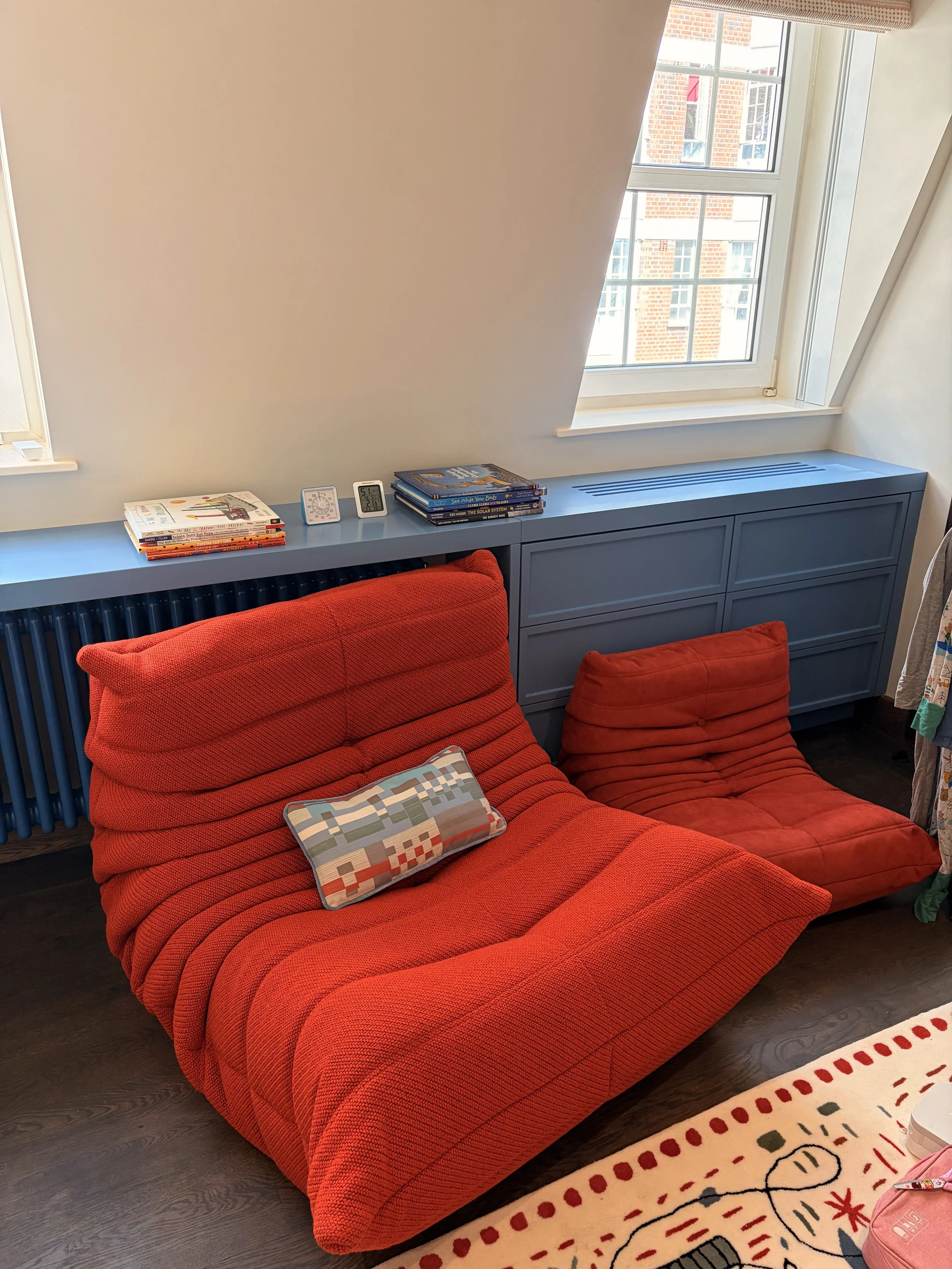
A reading corner softened with muted green textiles can feel different from a dining space layered with warmer tones. A home office painted in gentle blue can feel more focused than the adjoining family room, even though both remain connected. A play area might use softer, more contained colour cues to help children understand where activities begin and end.
These transitions do not need to be dramatic. In fact, the most successful examples are often the ones you barely notice.
A shift in paint colour, a change in upholstery, a rug, a piece of artwork or carefully chosen accessories can all help define how a space is experienced.
Before long, your home begins to guide you naturally from one activity to another. Rest feels easier in one area. Conversation flows more naturally in another. Work feels more focused elsewhere.
Common Colour Mistakes That Can Make a Home Feel Less Calm
Colour is personal, but there are a few common mistakes that can make a home feel busier than intended.
Choosing a colour before understanding the room
A colour that looks beautiful online may not work with the light, scale or purpose of your room. Always consider how the space is used before choosing a palette.
Ignoring visual clutter
A calm paint colour will have less impact if the room is overcrowded. Surfaces, shelves and storage all affect how colour is experienced.
Using too many competing tones
A home can absolutely have personality and contrast, but too many disconnected colours can make spaces feel visually fragmented.
Forgetting about texture
Colour can feel flat without texture. Natural materials such as timber, linen, stone, wool and woven storage can soften a palette and make it feel more layered.
Following trends too closely
Trends can be inspiring, but the best colour choices are the ones that support your routines, preferences and the way you want to feel at home.
Creating a Home That Supports You
This idea of intention sits at the heart of everything we do at Homefulness.
Whether we are organising a pantry, transforming a dressing room or helping a family settle into a new home, the aim is never simply to create something beautiful. Beauty matters, but only if it makes everyday life feel easier.
A perfectly organised wardrobe means very little if getting dressed still feels stressful. Equally, a beautifully decorated room rarely feels restful if every surface is asking for your attention.
The homes that stay with us are rarely perfect. They are thoughtful.
They are the homes where colours soften the edges of busy days, where storage quietly supports everyday routines and where nothing feels as though it is trying too hard. They allow family life to unfold naturally because every element has been considered through the lens of how it will be lived in, not simply how it will be photographed.
Creating a calm home has very little to do with chasing perfection. It begins by asking gentler questions.
How do I want to feel when I wake up?
What atmosphere do I want to come home to after a long day?
Where do I naturally slow down, and where do I need a little more energy?
The answers to those questions will always be more valuable than following the latest colour trend.
FAQs
What is home colour psychology?
Home colour psychology is the idea that colours can influence how a room feels and how people experience it. It considers how different shades can support rest, focus, warmth, energy or calm within the home.
What colours make a home feel calm?
Soft greens, muted blues, warm whites, gentle neutrals and earthy tones often help a home feel calm. These colours tend to feel less visually demanding and are often inspired by nature.
How do I choose colours for each room?
Start by thinking about what the room needs to support. Bedrooms usually benefit from restful colours, kitchens often suit warmer tones, and home offices may work well with colours that support focus and clarity.
Can colour help with organisation?
Yes. Colour can make systems easier to understand and maintain. Matching baskets, coloured folders, tonal wardrobe organisation or colour-coded children’s storage can all help reduce visual decision-making.
What is colour zoning at home?
Colour zoning is the use of colour to define different areas within a room or open-plan space. It can help separate work, rest, dining or play areas without needing physical walls.
Can calming colours make a room feel less cluttered?
Calming colours can help reduce visual pressure, but they work best when combined with thoughtful organisation. If a room is overcrowded, even a soft colour palette may struggle to create a calm atmosphere.
Final Thoughts
Colour psychology is not really about paint. It is about creating an environment that supports the life happening within it.
When calming colours, thoughtful organisation and intuitive systems come together, something subtle begins to happen. Your home stops demanding your attention quite so often. You spend less time feeling overwhelmed by visual noise and more time enjoying the spaces around you.
That is what a calm home should do. It should support morning coffees that are not interrupted by cluttered worktops. It should make evenings feel more restorative. It should help each room feel easier to use, easier to maintain and easier to enjoy.
At Homefulness, we help clients create thoughtful, beautifully organised homes where colour, storage, flow and everyday routines work together.
If you would like support creating a calmer home that feels considered, practical and easy to live in, Homefulness can help you plan the right next step.
Because ultimately, the most beautiful homes are not the ones that simply look calm.
They are the ones that help us feel it.
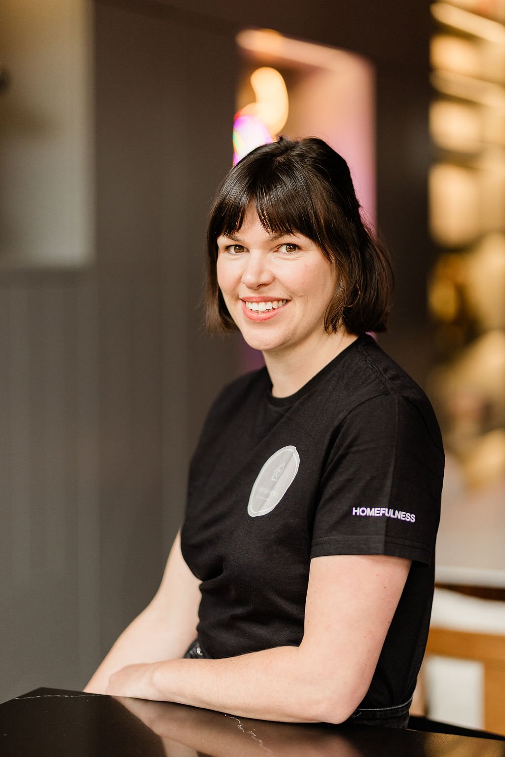
Jessica has been part of the Homefulness team since 2019, first as a professional organiser and now leading business development and social media. With a background in merchandising and retail management, she pairs a sharp eye for styling with practical, systems-led organisation, and has helped clients across London and the South East create calmer, clutter-free homes.
Meet the Homefulness team →Found this useful? Add Homefulness as a preferred source on Google.